For the Record
Translating the Experiences of New Music Discovery and Exploration Both In-Store and On Streaming Platforms to an e-Commerce Context
Responsive Website Redesign (Concept)
Solo | 3 Weeks
Case Study

Banquet Records is a record store in Kingston upon Thames, hosting 200+ live events a year, including shows and signings by global artists and upcoming acts alike. Their current website, however, does not highlight these events; poor information architecture and navigation options also limit users’ ability to discover everything the have on offer.
This was a solo project, so I was responsible for all stages of the research and design process.
Business Analysis
“Yeah, you could be the greatest, you can be the best” - The Script
As a music lover, Banquet Records is a local business I have admired for a long time.
Their USPs include:
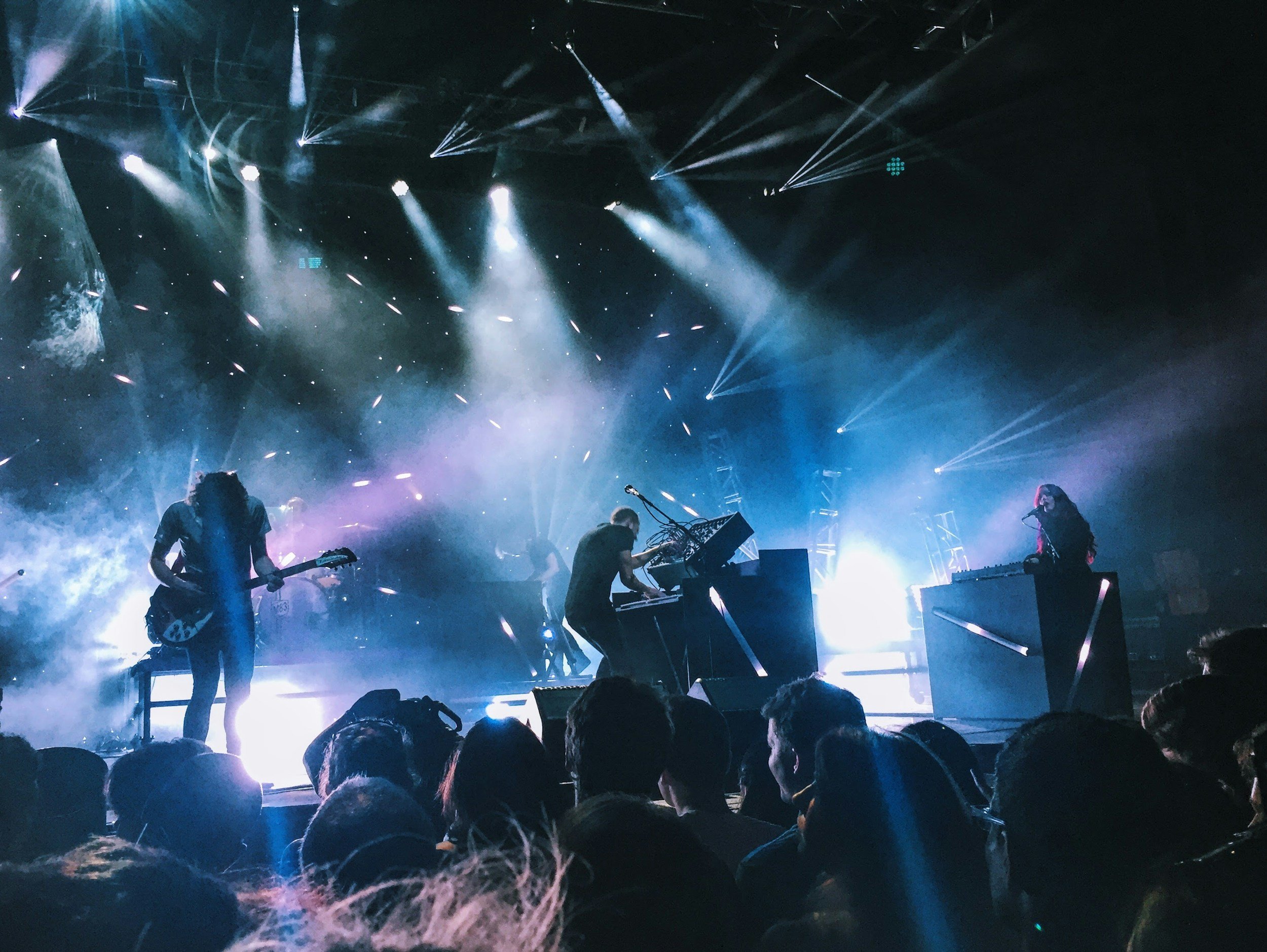
Hosting over 200 live events a year, including shows and signings by global artists and upcoming acts alike
Mandatory LP or CD purchases with event tickets
Inexpensive ticket bundles, typically under the £30 mark
Being the cornerstone of the Kingston music scene, especially for fans of alternative genres
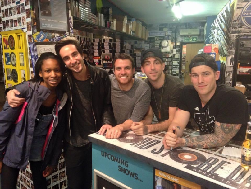
Me, aged 14 or 15, with All Time Low at Banquet Records

Heuristic Evaluation
Accessibility Audit
AccessiBe
Stark
WebAIM
“Can you take me higher?” - Creed
However, Banquet’s current site just doesn’t compare to how forward-thinking, energetic, and inclusive they are:
It feels dated
The colors are muted
Text styling is inconsistent
The layout is cluttered, with limited breathing room
It’s very product-forward and doesn’t convey their unique selling point well
There is very limited filtering and sorting, making it difficult to explore
None of these color combinations in use on the current website pass contrast tests
The information architecture is confusing and related items are scattered
There is no way to save favorites or preferences
The body copy is generally too small (11px)
There is an autoplaying carousel on the homepage that cannot be paused
There are several instances of button labels that are not descriptive enough
Screenshots from the current Banquet Records website
Competitor Analysis
“Anything you can do, I can do better” - Ethel Merman and Ray Middleton
To identify potential areas for opportunity, I conducted a broad audit and feature inventory on some direct, indirect, and replacement competitors.
Discovery and Personalization arose as key issues that competitors tacked well.

Spotify
(Replacement -
Streaming)

Rough Trade
(Direct)
Flashback Records
(Direct)
Bandsintown
(Indirect -
Concert Discovery)
Newbury Comics
(Direct)
Product Discovery:
Improved filtering/sorting so users are inclined to explore and not just search for what they already want
Recommendations based on preferences/listening habits
Allowing users to save favorites or subscribe to particular artists for release/show updates
Information Architecture:
Consistent categorization
Improved visibility of shop contact information
Simplified footer with more options in a dropdown at the top
Dedicated artist pages where all releases/tickets/merch can be seen at once
Interaction/Visual Design:
Using carousels and s-curves to break the monotony of grids
Clean, minimal design, allowing imagery to speak for itself
Other Features:
News banner
Reviews/testimonials
Pushing the experiential side of the business more
User Interviews
Usability Testing
Affinity Mapping
Testing Teardown
Figjam
Dovetail
Zoom
“Tell me something good” - Rufus
To round out the initial discovery process, I conducted remote, moderated research sessions on Zoom with 4 participants who had a keen interest in music.
The sessions combined usability tests on the current site, asking users to check out the about page and then purchase a record and an event ticket of their choosing, and interviews exploring what I consider to be the three pillars of music consumption to see what additional information I could pull about the music space.
I subsequently used key insights from these sessions to model the average user group through a persona and journey map.

Streaming
Live Music
Record Shopping
Participant 1
Female, 30s
Plays in a band
on the side
Participant 2
Female, 20s
Casual music lover
Participant 3
Female, 30s
Trained musician and
former music manager
Participant 4
Female, 20s
Casual music lover
from a musical family
User Interviews
Persona
“Nice to meet ya” - Niall Horan
Meet Alyx…

Background Information
Young music lover living in Kingston upon Thames
Has been to a couple Banquet Records shows, having seen them on the artists’ socials and being thrilled by the low price
Has only visited the store a couple of times to browse as she doesn’t own a record player
Thoughts and Feelings on Music
Streaming on Spotify is her primary method of listening to music; she sees records as a souvenir or way to support her favorite artists instead
She likes receiving personalized recommendations based on her preferences or listening habits
She values the personal connection and intimate aspects of music, such as seeing live shows
She chooses what to listen to based on vibes/mood
She would be more inclined to buy records in store as it is easier to explore
Cost is a factor in her music engagement/purchasing habits
Usability Testing
User Journey Map
“I still haven’t found what I’m looking for” - U2
Reactions to the Banquet Records Site
“It looks so underwhelming”
“Do they not have pop music? Oh, I guess they only have these three genres?”
“They should really highlight the events more; that’s what attracts me the most”
“Is that really the price? That’s so affordable!”
“Can I not sort?”
“I wish it would recommend me artists to check out based on my search or listening history”
“I would only come on here if I knew what I wanted already”
User Journey Map
Below is a snippet of the user journey map I created based on usability testing feedback, with the full version available to download below.
The journey map outlines the primary pain point that emerged, which was that poor information architecture and navigation options made it difficult to see what was on offer and find discover new music.

Pluses and Deltas
“I just wanna feel” - Robbie Williams
What was working…

The Experiential Side of the Business
Test participants loved the that the service focused on inexpensive live shows, intimate musical experiences, human connection, and supporting artists through LP and CD purchases
The Checkout Process
Test participants felt that the checkout process was very straightforward and easy to use, and also enjoyed the animation showing items being added to the cart
What needed to be fixed…

Promoting the Experiential Side of the Business
Participants loved what Banquet had to offer when I explained it to them
Live shows are not immediately brought to the forefront, through verbiage, hierarchy, structure or imagery
Information Architecture and Navigation
The genres are scattered and randomly organized, immediately turning users away if they don’t see a genre they like
Features like sorting, filtering, and tags are not readily available and can only be found on some random buried pages, making it difficult to casually explore the site
Users cannot easily find new artists or figure out if the artists coming to play are of interest to them, so they feel inclined to go to other sites
Accessibility
Accessibility issues such as auto-rotating carousels and poor contrast made the site difficult to scan
Visual Design
The visual design is a turn off as it feels dated and underwhelming
How Might We
Problem Statement
“Where do we go now?” - Guns ‘N’ Roses
A combination of synthesis and prioritization led to the following problem statement and design challenge.
Alyx has a problem…
Alyx needs to seamlessly discover emerging artists and their upcoming performances at Banquet Records that suit her preferences so that she can enhance her experience of engaging with new music by leveraging Banquet’s commitment to fostering affordable in-person experiences and supporting artists directly.
…and we need to solve it!
How might we enable Alyx to easily utilize Banquet Records as a center for music discovery, making memories, building human connections, and supporting artists in an affordable way?
Paper Sketching
Ideation
“What’s that coming over the hill?” - The Automatic
Aside from making general improvements to the site’s visual design, navigation, filtering, and organization, I needed to figure out how to address the ‘discovery’ aspect of the core problem statement. I started by doing a round of ‘Crazy 8s’ sketches to generate ideas.
Deprioritized Ideas
“Playlists”
Mood Filter
A discovery page allowing users to find artists, releases, and events by selecting mood/vibe-themed “playlists.”
A simple filter options with mood/vibe descriptors.
Sync Spotify
“Sounds Like” Tags
The ability for users to sync their Spotify account (or any other streaming service) to generate tailored suggestions.
Event cards simply having a line underneath them saying “sounds like” and a couple of larger artists in their genre.
Single Word Search
Generating suggestions by allowing users to type in one word (or name/short term).
In-Event Recommendations
Events Highlighted Within Genre Pages
Having recommendations within each event for similar sounding artists coming to Banquet.
Highlighting upcoming events at the top of each genre landing page.
Selected Idea: Discovery Cart
Users are given 3 minutes to “shop” for albums/artists/genres etc. they already like and then custom suggestions are generated, which they can save or email to themselves.
This feature captures a user’s mood in realtime based on their choices rather than potentially ambiguous “mood/vibe” filters. Additionally, it can be a ubiquitous feature, and not just used for events.
I settled on this idea as after looking more closely at the existing checkout process when started to carve out the user flow, I noticed the option to opt into custom emails based on the items your were purchasing.
This meant that Banquet already had the technical infrastructure to generate custom recommendations based on purchases, and so I decided to leverage that existing feature and integrate it more seamlessly into the discovery and exploration process.
Optimal Workshop
Survey
Card Sorting
“Somewhere I belong” - Linkin Park
Before jumping into design, I conducted a remote, unmoderated open card sort with 14 participants using Optimal Workshop to ascertain how best to organize the products on the site.
Product Categorization
Giving participants a selection of event tickets, LPs, CDs, and merch, I was curious to see if they would group them by product type, genre, artist, or something else.
62%
Product Type
21%
Genre
7%
Combination
7%
Likes vs Dislikes
The majority of those who sorted the cards by product type, used the term '“vinyls” instead of “LPs” in reference to records, and some also stated that they would sort by genre as a secondary category.
These results clearly indicated that I should focus the primary navigation on product type, but still offer a genre directory as a secondary option, which greatly challenged my initial assumptions.
These insights inspired in a significant shift from the current nav bar which prioritizes the store’s three most popular genres and only reveals product types as a contextual navigation option.
The results also suggested that I should use “vinyls” over “LPs” when it came to verbiage.
All of this data influenced the sitemap.
Music Consumption Habits
I also asked some short contextual questions about music consumption habits in order to validate my earlier research.
43%
Merchandise
29%
Record Collecting
100%
Streaming
71%
Concerts
When it came to streaming, most participants used Spotify, with the personalized recommendations and playlists being a huge draw.
These results strongly buttressed my earlier findings and validated my decision to promote the discovery and live music aspects of the business and general record store experience.
Product Proposal
Figjam
Figma
“The start of something new” - Drew Seeley, Vanessa Hudgens, and Zac Efron
After an initial round of sketching ideas on paper, I finalized my initial product proposal and generated some mid-fidelity wireframes, which I used as a basis for validating my idea with users.
Wireframes
User Flow
Based on all of my research insights, I decided to focus on the following key flow for concept validation and testing:
Home > About > Discovery > Select Event > Checkout
Home and About
The homepage features an s-curve, which clearly introduces the key aspects of the business (with events listed first), reduces visual clutter, creates balance, and allows for consistency with slight variation.
The About page includes a brief overview of the business, explaining what makes them unique, clear store and contact info, which was previously hard to find, and a grid of staff headshots linking out to bios.
The Bio pages introduce staff members, giving the business an intimate feel. Feature such as staff music picks will encourage users to go into the store and strike up specific conversations, and also allow the business to push products.
Discovery
The Discovery landing page will provide a brief overview of the new feature and provide clear instructions.
The search component will feature various categories of items (e.g. genres, artists, releases) that users can “shop” in a traditional fashion by scrolling through, filtering, searching, and then clicking on any desired items to add to their ‘Discovery Cart,’ which will be displayed on the right.
When the time runs out, or if the user hits the “Generate” button early, a page of recommended artists, events and releases will be presented to users, with the option to redo the Discovery or email their results to themselves.
Product Page, Cart, and Checkout
For events specifically, the Product page will feature basic information about the show, as well as information to help users quickly get a sense of the artist, such as music videos related artists, and streaming links. Users can also subscribe to artist notifications, and purchase ticket bundles, which will he accompanied by product preview photos.
The cart will function as an overlay rather than its own page so as not to take users away from their current flow. Once a user clicks into checkout, their cart will be fixed to the right side of the screen.
The checkout process will be fairly standard and more or less follow the existing site as there were very few issues highlighted during usability testing, and end with a “Purchase Complete” screen.
User Interviews
Tree Testing
Usability Testing
“How you like me now?” - The Heavy
To validate my product proposal, I conducted remote, moderated sessions consisting of usability tests, brief interviews, and a rudimentary tree testing activity with 3 participants who were keen consumers of music.
Participant 1
Female, 20s
Occasional
record collector
Participant 2
Male, 30s
Avid record collector
Participant 3
Female, 20s
Frequent concert
and festival goer
What was working…
Prioritizing Live Events

The interview results echoed earlier sentiments of streaming being a daily form of music consumption, with live show attendance being quite frequent, and record shopping being more of a special event, thereby validating the overall direction I was heading in
The Discovery Feature

The Discovery feature proved very popular, with quotes including:
“I immediately want to do Discovery”
“I would keep coming back to this website just to do Discovery”
“I would use this instead of Spotify as I get recommendations and can support artists directly”
What needed to be fixed…
Distinguishing Discovery Mode

Although users understood the concept of the Discovery feature, 2 out of 3 expressed or demonstrated confusion when actually on the search page, as they were not sure if they were searching real products and adding real items to their cart
Prioritization of Store Information

All users were happy to see clear store opening hours, directions, and contract details, though 1 specifically requested that it was prioritized over staff bios
Making Navigation Verbiage More Accessible

All users missed that the About page could be accessed via “Banquet & Beyond” as it is quite branded and non-specific
General Information Architecture

Other minor edits, mostly relating to product organization, were suggested during the rudimentary tree testing activity I conducted, which involved sharing a simplified sitemap and requesting close examination of the proposed information architecture and verbiage
Content Strategy
“The pen’s in my hand” - Natasha Bedingfield
Moving into developing a high-fidelity prototype, I spent time putting thought into my general content strategy before thinking about establishing a style guide and reworking the wireframes.

Particular Considerations
Using people-centric imagery as I was now reframing Banquet Records as an experiential business rather an simply a store
Using subtle musical cues in the verbiage and UI elements to make the experience more engaging
Having a strong visual distinction between the main site and the Discovery section, with most of the site being simple and illuminated with bright, people-centric imagery, and the Discovery section being more experimental with color, highlighting the novel, generative aspect
Style Guide
Moodboard
Figma
Design System
“I feel pretty” - Marni Nixon
My content strategy outline informed an exploratory moodboard, which, in turn, led to the final color palette.
Moodboard

When putting together the moodboard, some of the keywords I had in mind were: human interaction, lively, energetic, passionate, bright, nightlife, modern, young, local, indie, forward-thinking, and generative. These were all drawn from my prior research.
I sourced imagery from some of my selected competitors, as well as Banquet Records’ own social media, and image libraries such as Unsplash.
Color Palette Considerations
General
Neutrals are used predominantly so imagery can speak for itself
Blue, inspired by Banquet’s current blue, is the key brand color for elements such as CTAs
Pink and Green, inspired by Spotify Design’s color palette, can be used as accent colors
Discovery
Pink and Green gradient, intended to represent generative AI and an input/output relationship, is only associated with the Discovery section to clearly distinguish it from the rest of the site
Dark Grey is the only color used alongside the gradient
Typeface Considerations
I selected typefaces that had perfectly circular ‘o’s in both cases to represent records and CDs
Montserrat (Body) is legible and has a wide range of styles
Sen (Display) has a bit more character, almost leaning into a handwritten feel, but remains clean and legible
Both typefaces are also Google Fonts, making them web safe and free of licensing concerns
High-Fidelity
Heuristic Evaluation
Accessibility Audit
Figma
Stark
WebAIM
“Stop, collaborate, and listen” - Vanilla Ice
Moving into high-fidelity prototyping, I made edits to my original wireframes based on the testing feedback and a secondary heuristic evaluation, and considered accessibility when starting apply color, typography, and interaction.
Copy Edits

I changed “Discovery Cart” to “Discovery Playlist” to minimize confusion with the real cart
I changed “Banquet & Beyond” to “Banquet Records” in the nav bar to add clarity
Design Edits

I switched the order of the store information and staff bios on the About Page
I made the cart a slide-out menu rather than a centered overlay to reduce disruption
I added a cart summary page to the Checkout process to reduce user error
As users can sign up for multiple mailing lists, I moved the email input on the homepage and in the footer to an overlay to simplify the process
Accessibility Considerations - Interactivity
Users have the ability to pause the timer during Discovery
All carousels are user-controlled and do not auto-rotate
The nav bar dropdowns are clickable (indicated by a dropdown icon)
Accessibility Considerations - Color and Typography
All color combinations pass contrast checks to at least AA standard, and AAA for gradient backgrounds
Overlays are used where text overlaps images
All non-decorative text is live
I selected clean, sans-serif fonts, with text size never going below 12px
I ensured CTAs are descriptive for screen reader users, e.g. “View All Genres” not just “View All”
Figma
High-Fidelity
“You like my hair? Gee, thanks, just bought it” - Ariana Grande
Before and After

Desktop Walkthrough
Mobile Walkthrough (Homepage)
Reflection
“Looking back over my shoulder” - Mike and the Mechanics
The most impactful outcomes from this project are:
Reframing the business in a way that maximizes profit and attracts a broader customer base
Enhancing personalization and product discovery through improved filtering, sorting, and information architecture and the introduction of a new recommendations feature
Refreshing the visual design of the site to match the energy of the business, and tackling various accessibility issues
Roadmap
“It’s not over” - Daughtry
Consult existing customers to user test and validate the current prototype, and determine whether my research and proposals align with their experience and perception of the business to increase the value of my redesign proposal.
Consult Banquet Records to ascertain whether they would invest in a redesign, what they would prioritize from a business standpoint, and whether my research and proposals align with their thinking. My proposed roadmap would be:
Phase 1: Address accessibility and basic information architecture issues.
Phase 2: Add tagging, filtering and sorting as far as possible and consider implementing the Discovery feature, even if it manifests itself in a simpler format.
Phase 3: Start to think more deeply about the aesthetic refresh, updated copy and restructuring of the site to promote events, how saved preferences affect the user experience after login.
The next steps I would take are:
Reflection
“Everything changes, nothing stays the same” - Stardust
Thinking about digital products as a touchpoint within a broader experience leads to more powerful outcomes
Going broad and indirect with competitor research can yield really valuable inspiration and is less likely to lead to 1:1 imitation
Augmenting existing features, rather than creating new ones from scratch leads to more efficient and economical solutions
It is okay to experiment with less refined, less polished research methods due to time limitations, as long as you obtain the right data